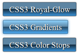
In the newer browsers, support for CSS gradients is stabilizing, making the choice for creating gradient buttons and elements purely out of CSS a viable alternative to background graphics.
 The syntax is also coming together so that, unlike in it’s first appearances, all browser syntax is the same. Microsofts IE will also be supporting CSS gradients in the new IE 10 version. For the older IE browsers, filters could be used to create a similar effect, although I personally tend to stick to a background gradient graphic together with a declaration for CSS linear-gradient for implementation by future IEs.
Creating a glassy/glowing button is becoming more straight forward, the logic and the syntax becoming easier to understand and to get to grips with. And of course, the really useful thing about CSS gradients, is that they’re totally scalable. The code snippet for this button creates an elegant whilst modern looking button with glow on mouse over. I’ve tried to keep the hard work in the CSS, reducing the need for bloaty spans, divs and wotnot. The snippet can be implemented purely on a link element.
CSS:
.royal-glow {
font:2em/100% Trebuchet, "Times New Roman", Times, serif;
color:white;
text-decoration:none;
text-shadow:1px 1px 1px #222;
display:inline-block;
padding:10px 20px 7px;
border:1px solid;
border-color:#254862;
background: url(royal-glow-bg-st.png) repeat-x center left;
background:-webkit-linear-gradient(top,#5D85A3 50%, #162B3B 50%, #388FD3 100%);
background:-moz-linear-gradient(top,#5D85A3 50%, #162B3B 50%, #388FD3 100%);
background:-ms-linear-gradient(top,#5D85A3 50%, #162B3B 50%, #388FD3 100%);
background:-o-linear-gradient(top,#5D85A3 50%, #162B3B 50%, #388FD3 100%);
background:linear-gradient(top,#5D85A3 50%, #162B3B 50%, #388FD3 100%);
-webkit-border-radius:3px;
-moz-border-radius:3px;
-ms-border-radius:3px;
-o-border-radius:3px;
border-radius:3px;
-webkit-box-shadow:0px 0px 2px #333;
-moz-box-shadow:0px 0px 2px #333;
-ms-box-shadow:0px 0px 2px #333;
-o-box-shadow:0px 0px 2px #333;
box-shadow:0px 0px 3px #333;
}
.royal-glow:hover {
background-image: url(royal-glow-bg-hover.png);
background:-webkit-linear-gradient(top,#8ED3FF 0%, #5D85A3 50%, #254862 50%,#4FAAF1 100%);
background:-moz-linear-gradient(top,#8ED3FF 0%, #5D85A3 50%, #254862 50%,#4FAAF1 100%);
background:-ms-linear-gradient(top,#8ED3FF 0%, #5D85A3 50%, #254862 50%,#4FAAF1 100%);
background:-o-linear-gradient(top,#8ED3FF 0%, #5D85A3 50%, #254862 50%,#4FAAF1 100%);
background:linear-gradient(top,#8ED3FF 0%, #5D85A3 50%, #254862 50%,#4FAAF1 100%);
-webkit-box-shadow: 0px 0px 5px red;
-moz-box-shadow: 0px 0px 5px #3891D6;
-ms-box-shadow: 0px 0px 5px #3891D6;
-o-box-shadow: 0px 0px 5px #3891D6;
box-shadow: 0px 0px 9px #388FD3;
}
HTML:
<a href="#" class="royal-glow">CSS3 Royal-Glow-Button</a>
Finished Button
Tips:
- declare the unprefixed version last, e.g. background:linear-gradient(…).
- If using background-image as a fall back, declare it first.
- Declaring border-color lets you set a different color for each border in this one declaration, e.g. border-color: red green blue yellow (in the standard order for group declarations, top, right, bottom, left).

 Create professional websites and online shops without programming:

