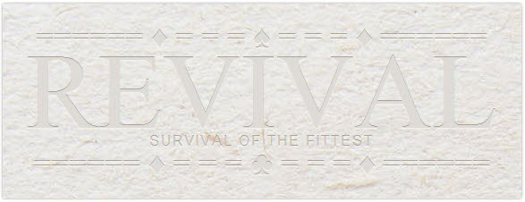
Embossed, letterpress text effects can be created as graphic work, but with just a few lines of CSS code, you can also create a this popular effect directly in your CSS code. This example covers how this can be done on a light colored paper texture background.
Using rgba color values to create a nice semi-transparent overlay, the main text color value was snapped from the background graphic, then shadow and highlight tones, used for the text-shadow, were created from this main color. The advantage of using the rgba color values is that they work well on both light and dark colored backgrounds, whereas solid hex colors don’t blend fully in with the background.
A paper texture background is applied to a DIV container, together with subtle rounded corners and outset background shadow. Text-shadow is also added to the DIV, because this inherits, the text within the container will all have the same text-shadow properties.
Margin and padding properties are set to 0 for the text elements, font properties are defined for individual text elements – H1, for the main text, P, for the decoration text, P class .sub for the subtitle text.
View embossed letters example (opens in a new window).
CSS Code
.one {
text-align:center;
width:540px;
margin:0;
padding:20px;
background:url(img/beige-paper-bg.jpg) top;
color:rgba(242,241,238,0.7);
-moz-border-radius:2px;
-webkit-border-radius:2px;
-o-border-radius:2px;
-ms-border-radius:2px;
border-radius:2px;
-moz-box-shadow: 0 0 3px rgba(81,74,66,0.6);
-webkit-box-shadow: 0 0 3px rgba(81,74,66,0.6);
-o-box-shadow: 0 0 3px rgba(81,74,66,0.6);
-ms-box-shadow: 0 0 3px rgba(81,74,66,0.6);
box-shadow: 0 0 3px rgba(81,74,66,0.6);
text-shadow:
0px -1px 0px rgba(147,140,128,0.7),
0px 1px 0px rgba(250,250,249,0.3);
}
.one h1, .one p {margin:0;padding:0;}
.one h1 {font:120px/90px times,"Times New Roman";}
.one p {font:36px/36px times, "Times New Roman";}
.one p.sub {
font:16px/16px arial;
letter-spacing:2px;
text-transform:uppercase;
color:rgba(242,241,238,0.4);
}
HTML Code
</pre>
<div class="one">====== ♦ = = = ♠ = = = ♦ ======
<h1>REVIVAL</h1>
survival of the fittest ====== ♦ = = = ♣ = = = ♦ ======</div>
<pre>
Disadvantages
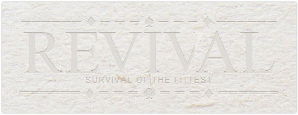
One great, disturbing disadvantage of using this method for display text is the choice of text formatting possibilities. In the example text, the word “Revival”, is a good example of a case for tracking and kerning, adjusting the space between letters, especially obvious to see between the V and A. Using the letter-spacing property, the spaces can be controlled, but is not always parsed nicely depending on the browser and sometimes produces overlapped masking. The screenshots below show how the example above, with applied letter-spacing between RE and VA, is parsed:
.one h1 span.kern-in {letter-spacing:-0.2em;}
.one h1 span.kern-in5 {letter-spacing:-0.05em;}
.one h1 span.kern-out {letter-spacing:0.03em;}
</pre>
<h1><span class="kern-out">R</span><span class="kern-in5">E</span>VI<span class="kern-in">V</span>AL</h1>
<pre>
Firefox:

Opera:

Safari:


 Create professional websites and online shops without programming:

