 A well designed website doesn’t mean always that a website is responsive too. But first of all: What’s responsive? First mentioned was the term responsive web design, based on an article at Wikipedia about responsive web design, in 2010 by Ethan Marcotte in an article for the magazine A List Apart. Before the introduction of responsive web design, designers used mostly multiple templates to display content on different hardware with different display sizes and resolutions like tablets or smartphones. Sometimes the displayed content on smaller devices was a function reduced version of the main website designed for classic desktop viewing.
The problematic of multiple templates
The problematic of using different templates is the high energy needed to develop different templates including an increase in possible errors. Because using different templates for displaying content on different display sizes is time consuming and can lead to a lot of problems, responsive web design offers not only an attractive alternative but also new ways to design. In contrast to multi template techniques responsive web design works only with one template, the front end display mostly determined by the CSS media screen values.
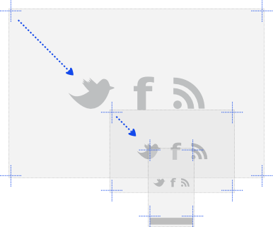
With responsive web design it is possible to create flexible web pages where elements adjust automatically to different screen resolutions and the design follows the user and his hardware. This includes especially the arrangement and size of navigation elements and content layout but can also include side bars and website interaction which is especially important for hardware with touch screens, which include tablets and smartphones offer by nature, but are also increasingly found on notebooks and modern convertibles.
The technique of responsive web design requires modern web standards like HTML 5 and CSS 3 but a lot of online and off-line tools to create web pages already include techniques to automatically create responsive versions so that in a lot of cases designers don’t need to write the necessary code manually.
The use of responsive web design minimises the time consuming care of different templates and offers a way for a well designed web page to be displayed in the best possible way nondependent from the hardware of the visitor calling the web page.
For Example:
A good example of a well designed and very beautiful website is www.distinctlydeutschland.com which offers wonderful luxury travel journeys to distinct places in Germany like Berlin, Heidelberg, Christmas markets, middle age and therefore requires impressionable photographic elements. However, although this web site contains much beautiful photography it is quite limited as far as responsive design goes and appears not to be fully mobile ready. The web site of the German travel agency is a good example how difficult it can be to display complex content optimally on smaller devices, especially on very small devices with a form factor smaller than 7“.
Increasing amount of smartphone users surfing the web
 The implementation of responsive web design may not always be easy to introduce, especially when a web site includes many pictures with a lot of information needing to be displayed on smaller devices but it is an investment well worth considering when you look at the increasing amount of users who use tablets or smartphones to surf the web. The statistics about device usage differs depending on each country and most of all on who was counting and publishing the statistics, but it is undoubted that the number of mobile users is rising and therefore it is becoming increasingly important to deliver the content in a user friendly way so that content adjusts automatically depending on the device. Responsive web design gives us the tools to do so.
Photo Credit:
Smart Phone / Tablet PC
© tashka2000 – Fotolia.com


 Create professional websites and online shops without programming:

